Hi community,

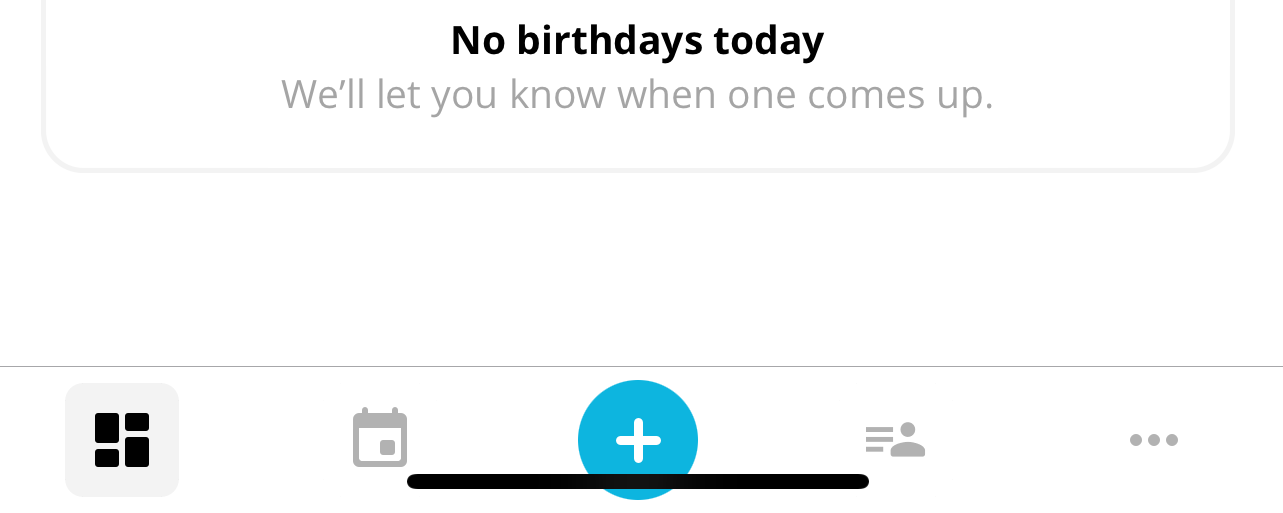
Is anyone else experiencing the same issue as me? The bottom navigation of the app appears to be stacked at the bottom of my screen.

I've searched the community, but I couldn't find any similar reports.

Does anyone have information on whether a new update will be released to fix this problem?


Hi @a.prodromou,

Happy Friday! 😃

I couldn’t find any other user with the same issue. Can you please clarify what do you mean by “The bottom navigation of the app appears to be stacked at the bottom of my screen.”? As per the screenshot I can see that it is as in the Help Center: The Personio App: Basic Functions, so I can’t identify what is the issue. More information would be greatly appreciate it. I guess you have all the updates up to date in your smartphone, but just in case I mention it, just thinking in possible reasons. 

An screen recording or video might also help us to understand. I hope with this extra information, I or any other Community member, can help you out! 🙌🏼

Looking forward to hearing back from you! 🙂

Best,

Zulema


Hi Support team,

Typically, the bottom navigation bar is positioned with a gap from the bottom of the screen to avoid overlapping with the swipe-up bar on the iOS devices. I have the iPhone 15 Pro Max. Please refer to the examples from other apps.


In the case of Personio, the buttons are overlapped by the bar. Please see below.


Hi @a.prodromou,

Thanks so much for the clarification and the examples! 😃

I have a few troubleshooting steps you can follow trying to solve the issue:

  1. Update the app to the latest version

  2. Logout of the app

  3. Force close the app

  4. Login to the app

If the issue persists, then:

  1. Clean up the app data (Android and iOS)

  2. Uninstall and install the app again

I hope this helps! I’m looking forward to hearing the outcome! 🤞🏼💪🏼

Wishing you a lovely afternoon!

Best,

Zulema


Your reply